Irregular series looking at Old School Fantasy typography...
 |
| TSR | Gygax | Classic Warfare 1975 |
 |
| Citadel Miniatures Logo 1979 by Albie Fiore |
 |
| The Hidden Shrine of Tamoachan | TSR | 1980 |
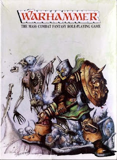 |
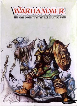
| Warhammer Circa 1983 |
 |
| Dungeon Dwellers Heritage | c. 1981 |
 |
The Lichway | Albie Fiore | White Dwarf 9 | 1978 |
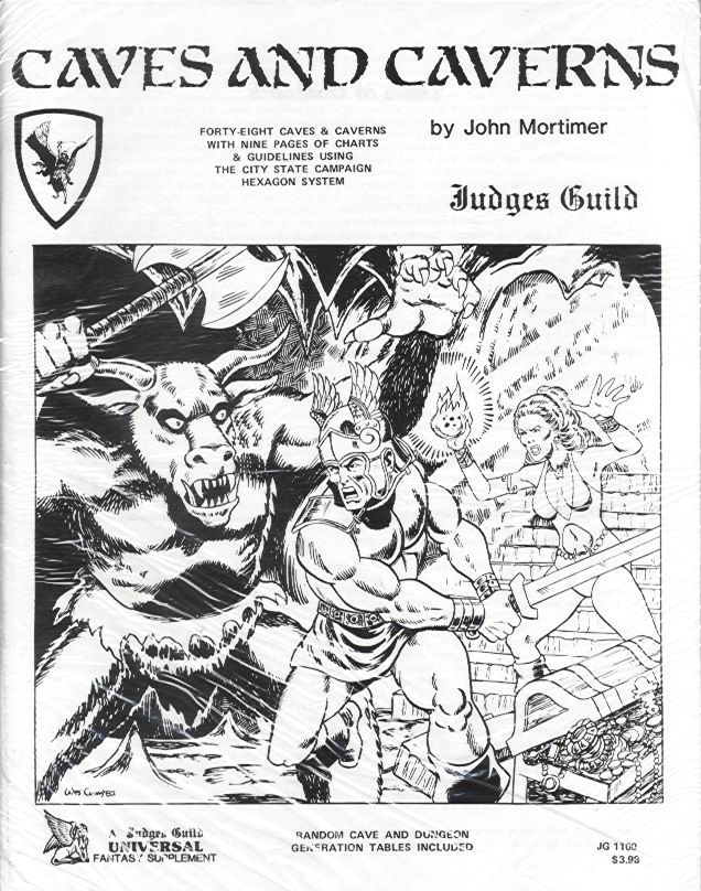 |
| Caves and Caverns | Judges Guild | 1982 |
 |
| Palladium RPG | 1983 |
 |
| Advanced Civ, |Avalon Hill | 1991 |
In the 80s, before commercial graphic design became something that happened on computers, the only way to get fancy lettering without laboriously and hugely skillfully hand-drawing it was to use dry transfer or rub-down lettering, such as is/was produced by Letraset or Normatype. Some of these typefaces took on the job of defining of a genre. Whether this was due to various companies copying each other or all trying to communicate a similar set of ideas through their design, it's hard to say without actually interviewing everyone concerned (if you were responsible for any of the designs above and happen to be reading this, drop me a note, I'd love to hear what went into the work).
 |
| How to do Rub Down Lettering | Helvetica | Letraset |
The case in point - a rubdown lettering called
Stonehenge published by Formatt, now infamous across the universe as the logo of the most successful toy soldier company since those little green Army Men guys. Notably, Stonehenge has some forms characteristic of a Roman 'rustic' lettering or
capitalis rustica - the flourishes on the V, W and the extended L all point to that being the basis for the design, although these forms range from 1st - 8th Century. the A is particularly quirky letter - which is more of an
uncial type. Picking exactly what historical samples served as a model for Stonehenge is more PHD level research than a simple blog-post, it seems to be an amalgamation of 8th C calligraphic forms. Yet the designer also appears to have rationalized the use of curved strokes from calligraphic writing to
a more inscription, carving, based model, where straight lines tend to dominate see the M, etc.
 |
| rustica |
 |
| uncials |
Stonehenge also has serifs (the little 'ticks' at the end of letter strokes) which originate from Roman stone-carved letters and are a common feature of commonly used typefaces like Times New Roman and so on. So in its form Stonehenge seems to embody an alternate history, where stone-carved letters were based not on the civilized, orderly models of Roman inscriptions, but instead on the parochial, rustic, barbaric letter forms, which in the alternative history have become the dominate form, and subsequently used in monumental inscription.
But Stonehenge isn't a straight typographic revival of old historical forms given an alternative twist. The forms are distressed - given jagged edges, broken parts and rough edges - designed to
make it look like had been printed off an ancient battered metal casting
- the indentations are consistent with damage, rather than say rough
edges of paper that something like the universally derided
Papyrus uses. Putting too much and repeated weight on metal or wooden type (until the age of off-set litho, most typography was produced via relief printing) will cause the serifs and thin strokes to split off and crack, the edges also get dented from being knocked around - all of which naturally happens to physical type over time. This distress also plays into the physical hand-work of using rub-down type, parts of letters can be missed off, or broken by not applying an even pressure. The distressed edges of Stonehenge is playing to the
advantages of the medium and turning the serendipity of the process into something that feeds back into the design.
So not only are the letterforms based on a pseudo-historical model, they have been made to look like they very material of them has been used and abused for a very long time, giving it an even stronger and more unusual 'antique' feel and that's possibly why it's a firm favorite of the 80s fantasy art-director.
It's also worth noting that many designers didn't use the rub-down transfers at all, but instead hand-drew the lettering, using the type-specimin as a model, adding yet another level of
quirk, strangeness and charm.
To my knowledge, there have been two digital revivals of Stonehenge, both distributed for free.
Moria Citadel by
Russ Herschler of Dragonfang - onlne gaming supplies retailer and archive of many an adventure sheet. Russ was kind enough to point me in the right direction for the origin of his font (Stonehenge, Formatt). I used a slightly modified version Russ's font on the classic "
OLDHAMMER: In Battle There is No Law" T-shirt and there is also
Satans Minions by
Mickey Rossi
P.S. If anyone out there in internet land has any rub-down sheets of Stonehenge, I'd be interested in acquiring some!


I love that strange, arcane "A". I think of it as the Warhammer A but I am glad to discover its real name.
ReplyDeleteYes, the "A" is one of the glyphs that give it most charm! The uncials are origins of the double-story a that you see everywhere from Helvetica to TNR!
DeleteZhu, reading your blog sometimes seems like attending a graduate level class - but one that I'd actually show up for! Fascinating background on a classic font. Thanks for the free education!
ReplyDeleteWhat a strange college that would be. Archeotypography of the Fantastic. Must also congratulate you on a fine re-drawn rendition of 'Stonehenge' on your Tiny Basement Wars masthead.
DeleteI always enjoy learning more about fonts. Thanks for the article, and the Hawkwind reference.
ReplyDeleteYou're welcome. It's always nice to sneak a bit of heavy rock into blogposts about old school gaming, and Hawkwind of course have the Moorcock connection. Although given the name of the font, I could have gone with some Spinal Tap.
DeleteSomething else this blog has encouraged me to take a much more active interest in.
ReplyDeleteI would absolutely sign up for classes on the Archeotypography of the Fantastic!
Hey Stuntcat. I've got some broken image links up there to fix eh!
DeleteA good place to start is this old TSR fonts page.
There is also a thread on the Oldhammer Forum: Games Worskhop fonts that covers a lot of ground on early Games Workshop products.
Of course that's just gaming focused, a real study would have to go right back to the early pulps, Weird Tales, etc. Hmm... maybe even 18th Century chapbooks even down to the Palaeography of the Beowulf manuscript and other fantastical bestiaries.